
Investors always seek the right entry point to buy Bitcoin to maximize profits. One useful tool for identifying entry points is the Bitcoin rainbow chart, which presents visualizations that are easy to understand. For a detailed explanation on how to read this indicator, be sure to check out the full article below.
Article Summary
- 🌈 Bitcoin rainbow chart is a chart that visualizes the movement of Bitcoin over time. It can help investors to identify long-term price movements of Bitcoin.
- ⚖️ Similar to a rainbow, the Bitcoin rainbow chart consists of various colors, each of which provides a specific indication. Historically, the red and blue colours have been the turning points for Bitcoin.
- 🚨 One of the drawbacks of the rainbow chart is that the price range is based on the assumptions of the creator. This makes the chart less reflective of current market conditions and future price changes.
- 🔭 As a single indicator, the rainbow chart will be much more helpful when combined with other indicators.
What is a Rainbow Chart?
The Bitcoin rainbow chart is a chart that visualizes the movement of Bitcoin over time. Bitcoin rainbow chart can help investors to identify Bitcoin price movements in the long term. Through the rainbow chart, investors can see the evolution of Bitcoin’s price from its launch in 2009 to its latest price.
As the name implies, the chart visualization is displayed as a rainbow. Like a rainbow, this chart also has colours in the rainbow where each colour has a different price level and advice.
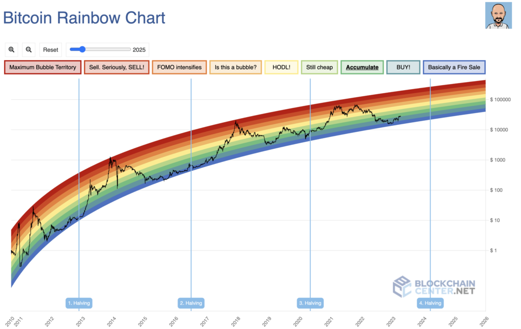
The blue level, or “basically a fire sale”, is the lowest level, and the red level or “maximum bubble territory”, is the highest level on the rainbow chart. When the price of BTC is at the blue level, it indicates that BTC is oversold. If the price of BTC is at the red level, it shows that BTC is overbought.
Another reason this chart is called a rainbow chart is because it looks like a rainbow. This is in line with the price of BTC moving from its lowest point and continuing to strengthen. Investors who want to use the Bitcoin rainbow chart can access it through the Blockchain Center website.
In addition to the rainbow chart, you can also conduct analysis using stablecoins.
How to Read Bitcoin Rainbow Chart
Unlike most other technical indicators, reading a rainbow chart is relatively easy. You just need to understand the five colour groups: blue, green, yellow, orange, and red. Each colour has specific suggestions that can be used as analytical tools.
- 🔵 Blue. This is an area where the price of BTC is at a discount, making it a good place to buy. However, it has no lower limit, aka the price can continue to fall. Inevitably many consider buying in this area risky.
- 🟢 Green. At this level, investors are advised to buy because BTC has come out of the bottom phase and is expected to continue rising. This level could be the right entry point for investors who feel the blue level is too risky.
- 🟡 Yellow. It signifies the hold phase. The price of BTC is not considered too favourable to take profit. Investors are advised to wait and see where the BTC price movement goes.
- 🟠 Orange. At this level, BTC is experiencing a bull run phase accompanied by FOMO momentum. For cautious investors, this moment could be a sign that the price increase is ending. For aggressive investors, this moment is believed to continue thanks to the support of FOMO by most investors.
- 🔴 Red. The red area signals investors to sell BTC immediately. BTC is already at its peak in this area and could potentially experience a correction at any time. However, like the blue level, it also has no upper limit, so the price can continue to rise.
The Founder of Rainbow Chart
The exact origin of the Bitcoin Rainbow Chart is unknown, as it is a tool that has been created and modified by various individuals in the cryptocurrency community. The chart was first popularized in 2014 through the Bitcoin forum on the Reddit site. The first to create it was a Twitter user named Bitcointalk.
However, since 2014 many parties have modified and improved the quality of the Bitcoin rainbow chart indicator. Now, a figure named Holger is the party that manages the rainbow chart website.
Most recently, in 2022, Holger updated the Bitcoin rainbow chart. The Bitcoin rainbow chart has a complete formula in the second version. Not only that but now every Bitcoin price movement on the rainbow chart is also in accordance with each colour. In the previous version, some Bitcoin prices were outside the colours of the rainbow. Plus, now users can also zoom in or out on the rainbow chart.
Find out how to read the whitepaper of a crypto project in the following article.
Is The Rainbow Rainbow Chart Accurate?
The data displayed on the Bitcoin rainbow chart is only based on existing historical data. Thus, users cannot use the rainbow chart to predict BTC’s future price. The explanation on the Blockchain Center website states that the rainbow chart only fits two curves. One is the best fit for Bitcoin’s highs (red) and one that includes only the lows (blue). The rest colour area was just interpolated and adjusted to the upper and lower limits.
Thus, this makes the rainbow chart created only based on the assumptions of the creator. Each colour on the rainbow chart is based on a random price range. Inevitably, the price does not accurately reflect current market conditions nor expectations of future price changes. This ultimately makes the accuracy of the rainbow chart questionable.
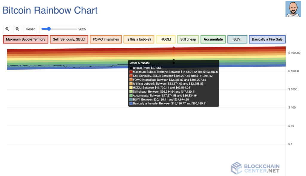
As in the example above, when BTC’s price is US$27,956, the rainbow chart displays each BTC price range for each level. However, the calculation method for determining the price range is not explained. As a result, the data is interpolated or just random estimates.
Limitations of Rainbow Chart
The main limitation of the rainbow chart is that it cannot be used as a single indicator. Investors still need to use other indicators as a complement to get more optimal and precise analysis results.
As mentioned earlier, the rainbow chart also uses data based on the assumptions of its creator. This makes its accuracy and conformity to market prices questionable. For example, several BTC prices came outside the rainbow in the previous version. Given that until now, the calculations still used assumptions and interpolated data. There is a possibility that something similar may happen in the future.
Regardless, the rainbow chart indicator is still useful when combined with other indicators. Various on-chain indicators or fear & greed index can complement the rainbow chart indicator.
Find out the difference between on-chain, fundamental, and technical analysis in the following article.
Conclusion
The Rainbow chart is one indicator that has worked well since it was first introduced. Historically, the red and blue areas have been turning points for Bitcoin. However, historical prices do not reflect future price movements. Also, remember that the rainbow chart indicator is not financial advice. It’s just a tool which will be much more helpful when combined with other indicators. By using rainbow charts, investors can make more informed investment decisions. Last but not least, always do Do Your Own Research before making investment decisions.
Buy Crypto Assets in Pintu
Interested in investing in crypto assets? Take it easy, you can buy various crypto assets such as BTC, ETH, SOL, and others safely and easily. Furthermore, Pintu has subjected all its crypto assets to a thorough evaluation process, emphasizing the importance of prudence.
Pintu is also compatible with popular wallets such as Metamask to facilitate your transactions. Download Pintu app on Play Store and App Store! Your security is guaranteed because Pintu is regulated and supervised by Bappebti and Kominfo.
In addition to executing transactions, in the Pintu Apps, you can also learn more about crypto through various Pintu Academy articles updated weekly! All Pintu Academy articles are made for knowledge and educational purposes, not as financial advice.
Reference
Holger, Bitcoin Rainbow Chart, BlockchainCenter, accessed on 7 April 2023.
Alexandria, What Is the Rainbow Chart in Crypto and How To Use It? CoinMarketCap, accessed on 7 April 2023.
Emily Shin, What is the Bitcoin Rainbow Chart? Data Wallet, accessed on 7 April 2023.